17 Amazing Ways a Hobonichi Techo 2022 Will Change Your Life
Hobonichi Techo planners have stolen my heart. As a verified card-carrying analog weirdo, my relationship with paper is multivalent and perhaps ever so slightly unhealthy. I nerd out over really great sticky notes. I write thank-you cards like it’s 1845. I go through pencils the way other people go through something they go through. Yet, though I gush over Leuchtturm 1917 pads and Moleskines and (oh, baby) Baron Fig notebooks, my daily planner is a crappy yellow legal pad and has been for a long damn time. Or it was.
I Will Spend 2022 Using a Hobonchi Techo Planner
There’s no good reason for this. I mean, there are a lot of good reasons for me not to do this. I tend to work in weeks, not days. My job is not terrifically demanding. I don’t have a long to-do list. It’s more of a to-do spectrum. Dated pages are not my style. I’m writing this article on a Monday morning and the to-do list I’m working from was laid down in tragically illegible script on my crappy legal pad last Thursday. I’ve only finished one item on that list. An organized planner like the Hobonichi Techo might be a huge waste of paper.
But I Can’t Help It: The Hobonichi Techo Is So Good
Everything about this planner is something that works. It’s like they get me: I love ultra-luxurious practicality. And so, below, please find my deep dive into the Hobonichi Techo 2022 planner. I cover every qualitative aspect that makes this planner great.
Just look at how beautiful it is!
The Paper: Tomoe River Paper Is the Gold Standard for Notebooks
Notebook nerds all over the planet go crazy for Tomoe River paper. So do fountain pen freaks. Tomoe River papers are considered world-class because they are luxurious, they won’t bleed, and they don’t feather.
Paper bleed is a nightmare for journal users and fountain pen writers. Ink bleeds right through cheap paper to the other side, running together with what’s already written there, creating a Rorschachian terror that’s impossible to read.
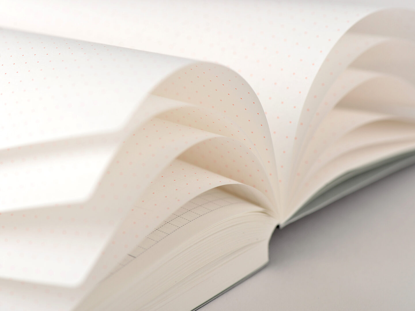
Luxurious and rare Tomoe River paper.
Tomoe River paper is coated on both sides with a substance comprised of elf tears and magic. I would love to tell you what the coating really is but I can’t find a definitive article and it doesn’t matter because Tomoegawa Papers has discontinued manufacturing.
Well, maybe. The rising panic in analog circles at the announcement of Tomoe River paper’s sudden demise may be an empty one. Things change and the Tomoegawa Co. has had to replace their machines. This means the 52gsm paper they’ve been making since Woodrow Wilson was in office, the onion-skin thin coated majesty that allowed for perfect inking, will now be made as 68gsm.
This is a significant difference — if you’re a paper nerd. If you’re a person who just likes to use your fountain pen on one side of the paper and still read what you wrote on the other side, then this doesn’t matter.
However, the Techo planners for 2022 use some of the last of the 52gsm paper, and that just makes them even more amazing since that paper is priceless.
Tomoe River paper is pH neutral, which means it is archival quality, which means your cat doodles will be preserved for their ultimate discovery and subsequent worship by future aliens.
User Design: The Hobonichi Techo Has Been Crowd-Sourced for More than 20 Years
Hobonichi listens to its users, and they employ remarkable designers so every element on every page has been tested in real life by countless users. Each element is highly useful, expertly designed, and so intuitive you don’t even realize you needed it.
Simple, elegant and useful.
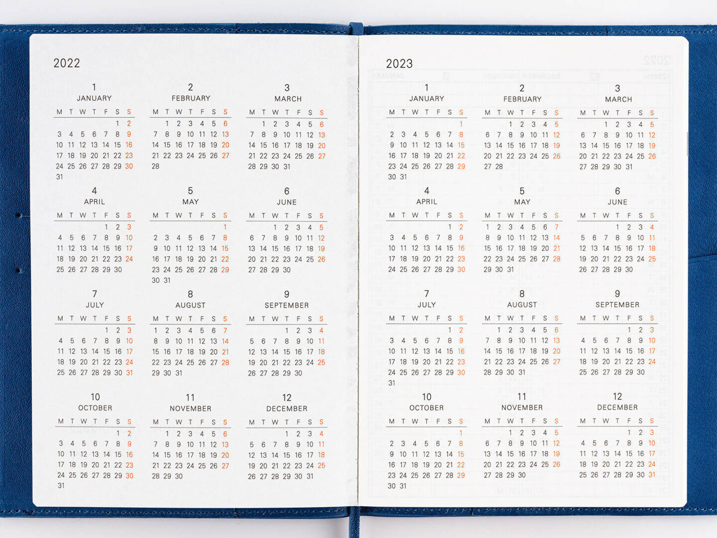
Like the way they present years in a Hobonichi Techo
I never really thought about this. A year is a year, it doesn’t really need any special treatment. But I was wrong. Crack open a Hobonichi Techo and the entire year is displayed for you across two full pages. Since those pages lay perfectly flat, you have a whole year at a glance with Sundays in red. It seems obvious, like every planner does this. But that’s not entirely true. Leuchtterm 1917 has a three-year overview. Moleskin doesn’t really have one that feels useful. I find the way Hobonichi presents the entire year useful both for circling important dates for seeing them at-a-glance and for helping me visualize my year.
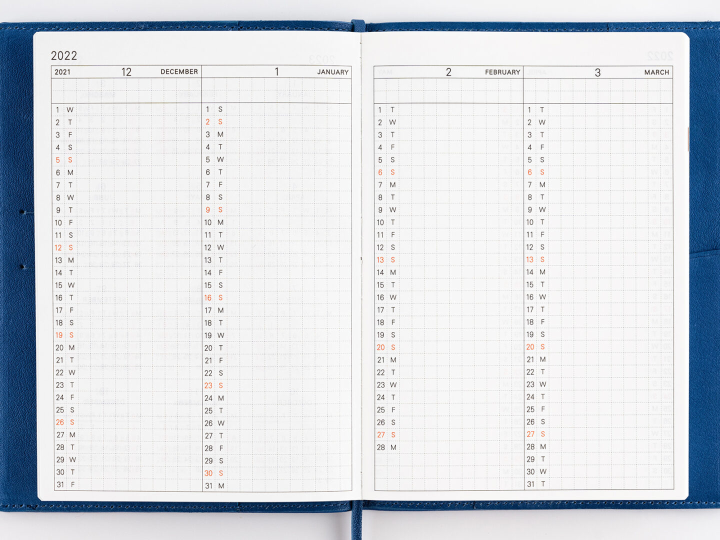
The indexed annual pages are perfect.
But they take it a step further with monthly index pages
This is really good for people like me who see time as a wormhole drawn by M.C. Escher. We need this kind of linear layout. Each month sits on a two-line space for notes then on top of 31 rows, each with the number and first letter of the day. It’s simple but also brilliantly useful.
Hobonichi Techo Planners Monthly Displays Are Also Amazing
Each day of the month is displayed simply, in a box divided by feint dashed lines into 30 small boxes. The analog nerd inside of me wants to use those boxes for something. There should be a system and after the briefest search of the interwebs, I was disappointed that no journal nerd had produced one. But the opportunity is there, which is part of how the simplicity of the Hobonichi Techo works for you. Want to turn a week into some kind of target-based Eisenhower box of productivity? You have 30 ways to do it.
Oh, But Those Daily Pages Are Sweet
Daily pages form the core of the Hobonichi Techo 2022 planner. This is where you’ll do most of your work and the daily pages are where Hobonichi has exerted their finest acts of genius. These design choices make the Hobonichi Techo 2022 the best choice for a planner.
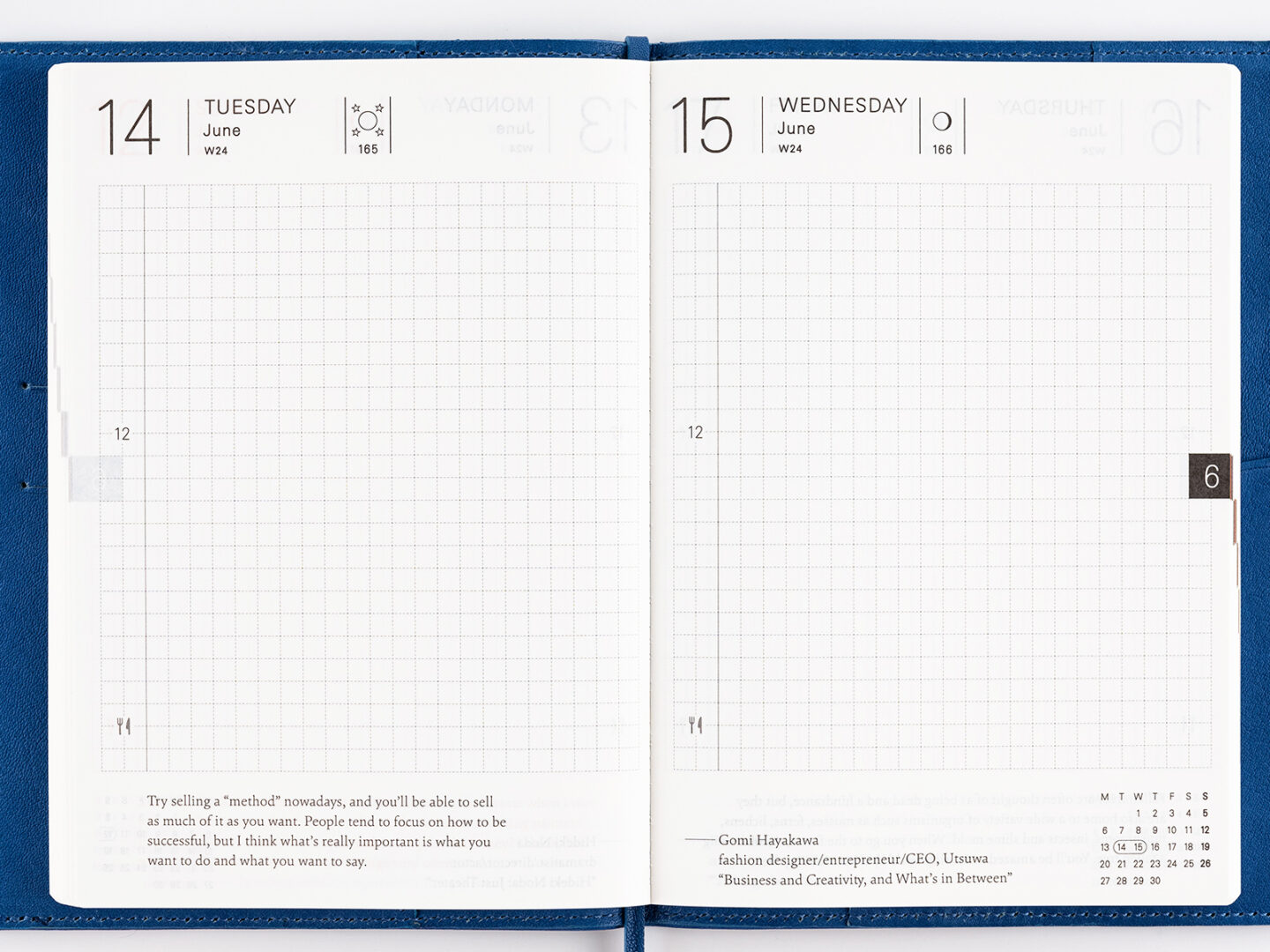
The date and week of the year and the moon phase are in the folio
The date is a standard design feature for a daily planner. Without it, the planner is not a daily planner, it’s just a journal. Hobonichi prints bare information, noting the date number, the week of the year number. The opposing folio shows the numerical day of the year and the phase of the moon for that day. Do you need to know the phase of the moon? Does your firm not hire werewolves? #werewolflaw
The left-hand margin timeline feature is my baby
Here is where the Japanese language Hobinichi Techo and the English version differ — and maybe not in favor of English. The Japanese Hobonichi divides the day in the verso margin into three-hour intervals. This lets you look at the day in small chunks. The English verso margin is divided at noon. Initially, it seems like you’re looking at the day in two chunks — and it makes you wonder what the designers were thinking. But I like the open format, the way the day isn’t divided so rigidly. I can still ink in my hours however I want or I can abandon rigidity and dance like no one is looking.
Do you plan your meals? Because you can plan your meals
It’s not much, but the bottom left side of the daily page has a little knife and fork emblem with no explanation of how it’s used. Are you jotting down your restaurant reservations? Are you keeping track of calories? Are you watching your carbs? Planning a meal? Shopping for kale? Yes. Yes, you are. They all fit here. And sure, it’s a little kitschy. A little trendy. But you’re probably already thinking about supper all day. It’s the carrot dangling off the workday’s stick. Might as well write it down.
Schroedinger’s Dotted Grid layout
The 4mm dashed grid, printed in a faint gray, is perfect because it’s there if you need it but kind of fades away if you want to disregard it. It allows for crazy customization. You can do just about anything with it if you’re a box and grid kind of thinker. You can build all kinds of complicated interconnected cubic constructions to organize your day. Or just disregard the grid entirely and organize your day with cartoons (this is common among Hobonichi Techo users.
Those colored monthly tabs are a big help
Tabs are one of the underrated great inventions of stationery science. They’re up there with page points and paper clips on being as ingenious as they are simple. The Hobonichi tabs the edges of each page with a nice black tab numbered for the month it appears in. Sundays are red, which is a helpful visual reminder of where you are in the week.
The Japanese version color codes the tabs for each month, which I prefer. But the minimalist design standards for the English language Techo skip that extra organizational feature. This may be great for design, but it may lose the tiniest little bit of usefulness.
Sundays are red
Every Sunday’s daily page is printed in red, instead of the light charcoal of other days. This is a simple visual reminder that a new week is starting and if you recognize Sundays as the official day off in your week, then it also indicates that you should be kicked back with your feet up. However, many of us use Sunday as an unofficial jumpstart on Mondays. The red printing signals it’s time to get cracking.
There Is a ‘Coming Up!’ Folio at the Start of Each Month
Which bears a kind of hopeless optimism that normally makes me want to throw things. But I think the employment of the exclamation mark in this phrase as printed in the Hobonichi Techo planners is motivating, not cringy. And yes, I know, that is a decidedly minor feature to get curmudgeonly on but I invite you, dear reader, to ask yourself, rhetorically: Have we met? Even the tiniest dot in the Hobonichi Techo planner is worth long, fruitful rumination, eyes furrowed in a quiet Stoicism as you think hard about whether or not this single instance of an exclamation mark is worthy of your furious indignation.
Informational Pages Are Informational
Every planner has a version of these pages, the fasteners that even up the page count and offer the widest most general usefulness. Yet, people like me find them the hidden gems of most planners. The Hobonichi informational pages are the most wackadoodle yet. I don’t hate these insertions, but I don’t find them entirely useful in a post-analog world. And I don’t find them useful in a post-post-analog world like, for instance, mine. If I sound like I’m making fun of them, please disregard the snark.
Sure, there’s the 17 dot grid blank sheets
Jammed in there after December. What are they for? How do you use them? Does it matter? The word JOT is often employed here as a general indication of what you’re supposed to do with them. But a planner needs some blank sheets and these are perfect in their dottiness, allowing for grid work, organization or insane doodling.
nd, of course, some contacts pages
As if your phone doesn’t work. I mean, here is an artifact of analog’s digital disdain I can’t get behind. My phone is the very best place to keep phone numbers and contact info because if I’m going to contact someone, I’m going to do it using my phone, even if I’m looking up their address to send them a card. However, there may be value in having contact pages in the back of the Hobonichi Techo. I just don’t know what that is.
nd conversion tables because Siri gets a day off, right?
I don’t even use a search page for converting weights and measures. I just yell at Siri and tells me that 11 teaspoons are almost four tablespoons so I can get back to my important research in cookieology. I wouldn’t look at a conversation table if you paid me. We need new throwaway pages! Why not a list of the most Etruscan verb modifiers?
Naturally, your personal information
A legacy holdover, but perhaps a more useful one. If you drop your Hobonichi Techo at the zoo and some helpful patron finds it, they can mail it back to you. Or throw it to the Monkeys. I mean, why did you bring your planner to the zoo anyway? If you’re a paranoid person, you’re not going to use these pages anyway. But if Reddit has taught me anything, it’s the value of an act of altruism for growing your fan base. So add your data and when you lose your wallet, just wait. Some streamer will bring it to you just to film the whole thing for likes.

What’s in your 100?
Finally, a Hobonichi Techo Planner informational page I really love: My 100
I’m a list maniac and Hobonichi hobo gets me. They have a two-page spread divided into 100 cells for you to track, list, or order 100 of something. This is where I would add my rolling bucket list, which is still in process. I mean, I’ve finally got my “five” figured out (Helen Mirren, Terri Garr, Sean Young, any of the goldfish from Fantasia, Peter Dinklage) and now I have to come up with 100 things I want to do before I croak? Well, at least I have a handy place to keep them now.
Not a 4X shirt on the list . . .
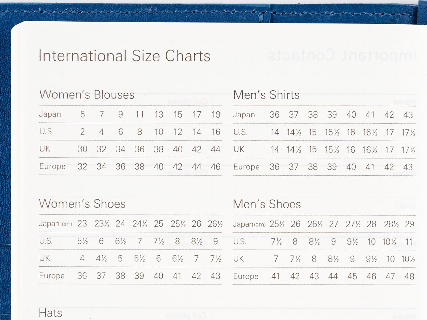
Finally, a planner that keeps track of international clothing sizes!
I can’t tell you how often I’ve gone and bought a blouse on the internet only to find out that 2X in Korea sizes will barely fit onto my arm much less over my august torso. Thank heavens the Hobonichi Techo has a hand chart of clothing sizes because I don’t know why.
I want to make fun of this but I can’t help but love it.
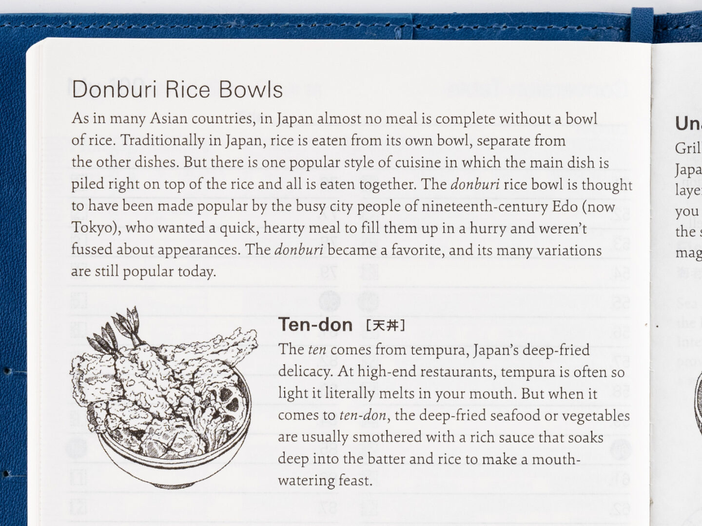
FINALLY, I CAN LEARN ABOUT DONBURI RICE BOWLS
Which is a very common meal in Japan. It’s pretty much anything on rice. Every dish’s name just means “this thing+rice.” These pages filled with rice dish lore are in every version of the Hobonichi. I feel like it would be as if the Franklin Planner people added a whole chapter on the various hot-dog styles of America — OK, now I get it.
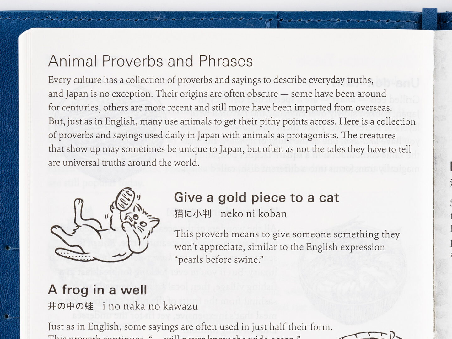
FINALLY, I CAN GET ME SOME OF THEM ANIMAL PROVERBS AND PHRASES
Because the Hobonichi Techo’s got them. Including the classic “give a gold piece to a cat” which is most like the American idiom “pearls before swine” or “cursive before the gen-z.” Maybe I need these warm animal proverbs and phrases, however, as a panacea for my inherent bitterness.
Perhaps the Hobnichi Techo daily quote can help?
On the bottom of the verso pages Hobonichi prints an inspirational quote. All of them are from the Hobonichi Techo’s author and designer, Shigesato Itoi, copywriter, essayist, lyricist, game designer and actor. Itoi is the editor-in-chief of his website and company Hobo Nikkan Itoi Shinbun, shortened to Hobonichi, which translates as “Almost Daily Itoi Newspaper.” Itoi posts brief essays, just a thought really, called “Today’s Darling” and it is these thoughts you’ll reed in your Hobinichi.
If you’re wondering how a copywriter from Japan may be relevant to your life, may I suggest Itoi has already been in your life? You’ve played his bass fishing video game and you’ve heard his voice in “My Neighbor Totoro” and you may have played his adaptation of Monopoly on Nintendo.
The Little Extras That Make a Hobonichi Techo Cool
Those mini-calendars hide amazing design tricks
Across from the daily quote, on the right-hand pages, you’ll find a mini calendar. Not exactly a stretch to include a mini-calendar in a planner. But in that mini calendar, the days of the two pages spread out before you are encircled. This is one of those discreet design features that underscore the overall generosity of the techo planner. It’s a visual reminder of where you are. I think it’s a huge assist in keeping you in the flow of the linear timeline.
Each Hobonichi Techo planner is numbered
Your planner will be stamped with a serial number on the inside of the back cover. You can’t do much with it, but there is a weird satisfaction knowing your planner is the only one with that particular number emblazoned in the back.
There is a lot of free space on the Hobonichi Techo pages
Around the daily pages and throughout the planner, marginal space is generous and constant. As a doodler, I’m very happy with the free space because I will fill it with cartoons, stupid numbers, bad math and strange geometry. You may find that space helpful in developing your own indicia or legends to modify and codify your own special brand of daily planning.
The 2023 pages are clearly watermarked in the Hononichi Techo 2022
The Hobonichi Techo 2022 will take you into 2023 but you’ll know it’s happening because the year 2023 is emblazoned across the spread in giant dark gray Helvetica. This is important if you have a lot of momentum at the end of 2022 and can’t find a way to slow down so that you skid ungraciously into the following year. Used to be you’d find yourself scrambling to make it all work, kind of like how January is always the month of “wrong year written on your checks.” Not anymore.
The craftsmanship is as good as the design
The Tomoe River paper is just the foundation for great craftsmanship in the Hobonichi planners. They are stitched together to lay open flat. This matters a lot to planner people. As the planner is used, it lays flatter and flatter, no matter where you open it. A planner should lay flat even if you aren’t using it. If you lay your Hobonichi open on your desk, it will stay that way as if it’s a ring-bound At-A-Glance planner. OK, maybe not in the first week, but it doesn’t take long for the thing to adapt.
Hobonchi Techo rounded corners are top-shelf details
Round corners are not only pretty, they are also practical. I work with my trusty legal pad right next to my laptop and I can’t tell you how much I hate its square corners. I catch them every time I move my hand so, after a couple of hours, the bottom-left corner of the top page is curled up and in my way and &%$#@! I’m so mad. That doesn’t happen when I’m using the Baron Fig and it sure as hell won’t happen when I’m six months into a Hobonichi Techo.
Small detail? Yes. Vital to my personal happiness? Like the air I breathe.
You can browse the Hobonchi Techo 2022 lineup here on the official site. The original book, which is A6 size and 442 pages, costs $32 or thereabouts. You can also buy the set, which includes a cover and various inserts, as noted. Fair warning, the 2022 edition was released September 1 and many versions are already on back order on U.S. sites. Amazon carries Hobenachi accessories but does not yet have the 2022 edition in stock.
The post 17 Amazing Ways a Hobonichi Techo 2022 Will Change Your Life appeared first on Attorney at Work.
Did you miss our previous article…
https://www.itcse.org/?p=149